ShopDreamUp AI ArtDreamUp
Deviation Actions


Comments45
Join the community to add your comment. Already a deviant? Log In
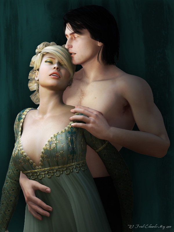
First of all, I want to say that this is a beautiful piece. You have captured the emotion well and while it is not exactly sultry, it is certainly sweet and loving which in my book is just as nice.
I love the green colours in this piece, they are really elegant and sophisticated, very romantic, yet a nice change from the usual pink or red or black. I do think the background could be a better colour though--the way it is now, it kind of makes the man look like he just suddenly disappears at the waste, because the pants look like a shadow on the wall-hanging!
The poses are all beautiful, my one nitpick in that department is that her left arm seems a bit stiff and awkward. I know the general feeling you were going for, and I think it is apparent to the viewer off the street, but it does come off seeming a bit unnatural. His arms and hands are all perfect, though. <img src="e.deviantart.net/emoticons/h/h…" width="15" height="13" alt="
There is one last thing that is bugging me in this piece, and that is her dress. The top part is gorgeous, I love the little glittery bits, but then I love anything shiny. <img src="e.deviantart.net/emoticons/n/n…" width="15" height="15" alt="
Anyway, this is a very beautiful piece and you are definitely coming along in the romantic scene department. You'll be taking orders for book covers before you know it.<img src="e.deviantart.net/emoticons/t/t…" width="30" height="15" alt="